 With plenty predicting that 2011 will be a year of Conversion Rate Optimisation we definitely think we’re looking forward to providing you with valuable insights towards increasing the conversion rate of your online channels this year. Our first topic doesn’t get much ‘buzz’ – it’s average order value (AOV), and basic tactics and methods for increasing this metric.
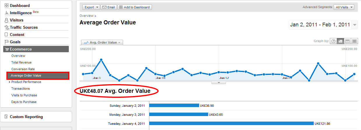
Firstly let’s get the definition right – the AOV indicator is usually used with e-commerce sites describing (surprise surprise) the average order value metric; literally the average amount of money your user spends during one transaction. In Google Analytics you can easily find it under the e-commerce tab:
Even though I’m going to use e-commerce sites as an example, AOV of some kind can be used in other types of sites as well: lead generation sites (AOV is the average value of services user is quoted for), subscription websites (average type of plan and duration), even content monetising resources can use a combination of average length and depth of visits.
If you have a problem with measuring the value of your average conversion then leave a comment below and we’ll be happy to help you out.
Some of you might ask “What’s this got to do with CRO?” and would be relatively justified. Not a lot of publications are mentioning AOV in the CRO process, but if we have a look at a some definitions of CRO and AOV this question will disappear…
CRO: Increasing number of sales/leads/subscriptions/any measurable business goals without increasing the amount of visitors; in simple terms persuading an existing visitor base to convert more often.
Tweak this slighty:
AOV: Increasing the value of sales/leads/subscriptions/any measurable business goals without increasing the amount of visitors; in simple terms persuading an existing visitor base to convert with a higher value.
The most important thing that CRO and AOV optimisation share is a focus on improving user experience and the expected value, rather than trying to mislead the user with dodgy/cheap sales tricks.
Cross-selling and up-selling
Cross-selling and up-selling are the two primary methods responsible for improving your AOV and every tip I’ll be sharing below is somehow related to one of them. Originally I was planning to precisely define each tip, but with several quite controversial definitions and opinions available in online publications or blogs I’m not going to waste the time. In the end the purpose of this post is to provide actionable insights rather than formulate the optimal definition.
1. Word choice
Some might think that this is a low importance factor but bear in mind how the human brain digests information – users would rather scan your landing page than read it through line-by-line, and the headline might be the only thing they notice. The quality of a headline should engage the user to notice your up-selling offer rather than lose their attention.
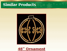
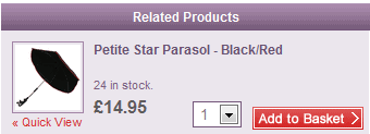
The most commonly used headings are without doubt “related products” or “similar products”. These are both useless in terms of justifying benefits for the user and so commonly used that are overseen by majority of users (similar to banner blindness).
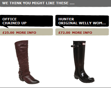
Lots of retailers self-confidently propose they know what I might like. Are they using mind-reading technology? CIA contacts? Seriously, how do they know? Each year I struggle with Christmas presents and could really use this solution…
None of these examples are giving a user some reason to spend more. Why should I buy more? Why do I need this additional item? These are just basic questions we all are going to ask ourselves and answering them should be the main priority of any e-commerce shop looking for the AOV increase.
Another issue I’ve started to hear more and more during user tests is a genuine hatred towards any kind of up-selling technique. With all the “recommendations” we are hearing from sales people in almost every brick and mortar store, restaurant or even internet provider we have completely lost any trust towards advice made by the interested party. Not least because the majority of these suggestions will be based on a company’s sales strategies rather than our needs, likes or benefits.
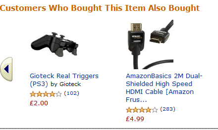
I hate using Amazon and other giants as an example (in majority of cases elements working at amazon would not work on your site) but with the word choice they are on top (although I’m sure there are plenty of other sites using similar headlines):
This type of headline above will kill two birds with one stone: provide sufficient enough reason for users to investigate the offers (word choice promotes indirect social prove – “If others bought something else with the same item than I should check it as well”) and eliminate a user’s negative opinion towards up-selling techniques (the heading clearly states that the choice of product for the up-sell is based on real user behaviour rather than sales objectives.)
2. Placement
While the importance of the last point is quite arguable and can vary from site to site, the placement of the up-sell/cross-sell promotion box will without doubt make a huge difference in the vast majority of e-shops. Unfortunately any common guidance or advice with placement would be literally useless because the effectiveness of any promo box will strongly correlate with your general page layout, primary product placement, hero image, calls-to-action (CTA) and so on.
However, there might be one suitable for everybody:
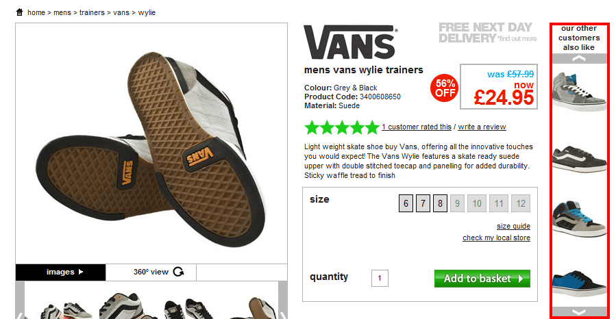
Avoid side skyscraper style placements or any format looking like a banner ad
The reason is simple – users rarely look at anything that looks like ad whether or not it is actually an ad. Banner blindness was real already 10 years ago and I am more than sure it is dramatically evolving year after year.
3. Focus on eye flow
There is a very common myth in the internet marketing industry that if you want to attract attention to a particular element or CTA just highlight it with bright screaming colours and enlarge to enormous size. If that were true then the annoying animated .gif banners from the 90s would still be the most effective method for customer acquisition.
Even if you’ve observed this type of change increasing click-through rate once or twice it doesn’t mean it works all the time. If your user is not even paying attention to the element or is dedicated towards a different one, no matter what colour or size you choose you are not going to engage him. Additionally, always bear in mind that in increasing the prominence of your up- or cross-selling offers you will always damage the prominence of your primary product. In the end, even if you succeed with the cross-sell promotion it doesn’t add additional value if the user doesn’t buy the original product.
Rather than wasting your time on highlighting your offer, focus on the eye flow of your average user and try to include the promo box where it naturally fits in with this and the decision making process.
Disclaimer: For those who haven’t heard about eye flow or require a quick reminder please check Anne Holland’s definition. Precise eye flow on your website can be investigated with eye tracking research, however due to very extreme costs we usually will use either Feng-gui (software simulating human vision mechanisms) or a couple of sessions of user tests with focus on eye flow.
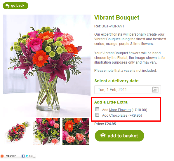
The example above clearly displays the points I was trying to raise. Neither bright colours nor extreme size make this cross-sell successful. It is a naturally-placed element fitting the eye flow (as the majority of users would start their fixation with hero image, briefly scan the copy, fixate on delivery field and then naturally scan additional items while moving towards the CTA) and the decision-making process (user has chosen specific product, then delivery date and now can think if he/she requires additional items).
4. One step further
The last method of increasing AOV I’ll share in this post is closely related to the decision-making process I’ve just mentioned.
With high-involvement products or services it might be a good idea to secure conversion on the primary product before introducing the up-/cross-sell on a separate page later in the funnel.
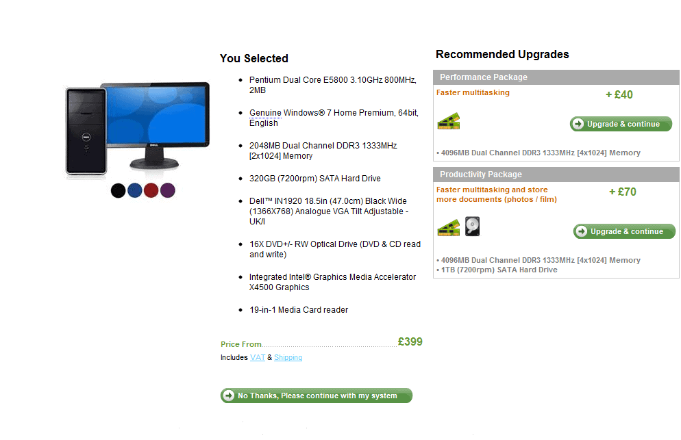
I guess Dell was the first serious e-commerce provider to implement this tactic in combination with standard up-sell methods.
Here a user lands on a product page after choosing a specific product. Note how many specifications the primary product already has, and imagine how much time and patience it takes for a user to choose the right one for them without any ‘recommendations’. It required a lot of user involvement and thought.
By allowing your user to take fewer decisions per page you can spectacularly simplify the entire process for them and decrease the anxiety which is usually impossible to avoid with these high involvement purchases.
And to finish…
Hopefully the set of tips above will help you to have another look towards you up-/cross-selling tactics and motivate you to start testing different variations. We have plenty of other tips and tactics for both AOV and traditional CRO coming soon, so subscribe to our RSS or start following us on Twitter @Attacats to stay in touch.
I’d be more than happy to hear some tips on increasing AOV from all of you so please share your ideas or question in the comments. Happy testing!
