We’re always interested in the use of language and text in call to action buttons so I’ve had a look at some medium, large and some huge ecommerce sites to see what is currently popular.
What is immediately obvious is that at almost every retailer I looked at, in almost every case the calls began with “Add To…” See below:
ASOS

Apple
![]()
The North Face
![]()
Clarks

HMV
![]()
Sofa Workshop
![]()
Guitar Guitar
![]()
Amazon

I actually had to hunt quite hard to find calls such as Buy Now or Buy Online. Thank you Pets At Home!

What I would really like to know is have these calls been chosen because they have been tested and shown to work better or is everyone just following the herd? There is no doubt that Amazon constantly test and even the smallest detail will be deliberate but can the same be said of Sofa Workshop or Guitar Guitar?
An interesting case study from Semorganic suggests there is a huge difference (although I would like to see some information on the statistical significance of these results). If their numbers are right Pets at Home could be closing the door to a lot of customers!
There are several other studies out there but what I would really like is for you to share your experience and any stats you have from your own testing and post them in the comments below.
On Thursday 22 September, Google are going to enforce their new Product Search data feed specifications. They have been blogging about the new requirements for a few months now, as they plan to improve the shopping experience for users. Having read many different versions of their requirements, I’ve found this table and these details to be most helpful. Looking over the required attributes, here’s my advice for meeting them with a few optimisation tips thrown in.
id, title & description
Every product needs a unique id number, if you don’t already have these you can easily do this in Excel by simply numbering your products from 1 – 650 or whatever, depending on how many products your have.
The title should be the name of your product, and if you’ve already optimised these for SEO reasons, consider the job done. By optimising, I mean make sure your product title includes keywords. For example, if you sell digital camera, be sure to include the words ‘digital camera’ in your product title as well as the brand name and model number. Descriptions don’t have a maximum length, but as the SERP’s tend to show just the first 150 characters or so, I recommend that you include keywords at the beginning of your descriptions, but avoid keyword stuffing.
google product category & product type attribute
The google product category attribute is required for apparel products in some countries including the UK and US, and is recommended for others. I would definitely ensure you have this attribute in your feed, and to find the right one for your products, you’ll need to browse Google’s product taxonomy. Some are in not-so-obvious places so if you think you can’t find an appropriate category, do keep looking so you’re confident you’ve got the best fit. Once you’ve found the most suitable sub-category, click on it and the text you need will appear in the box above the list. Using the digital camera example, the attribute I would use would look like this:
Cameras & Optics > Cameras > Digital Cameras > Digital Point & Shoot Cameras
As for the product type attribute, Google states that this is your category taxonomy, so use the categorisation you have on your own website. Again, this is just a recommended attribute, but I feel it can be particularly beneficial to use if you feel that Google’s categories aren’t quite relevant enough for your products. Structure this in the same way as the Google product category attribute (as above).
link, image link & additional image link
Obviously the link and image link attributes are required as your products won’t appear at all without these. As for the ‘recommended’ additional image link, I don’t see much benefit at the moment in adding more product images, but Google may have something up its sleeve so feel free to use this option.
condition
The ‘condition’ attribute has been required for some time now, so you should already have this in your feed. Your products need to be defined as either ‘new’ ‘refurbished’ or ‘used’. Refurbished relates to products like re-manufactured printer cartridges or refurbished laptops for example, where used products would relate to second-hand video games.
availability, price & sale price
I believe the availability requirement is Google’s way of improving user experience on e-commerce websites as they state that you must have the availability of an item on its landing page and can be penalised if the feed attribute doesn’t match. The options are ‘in stock’ ‘available for order’ ‘out of stock’ or ‘preorder’ so be sure to use the same wording on your own website to avoid having your products removed from the shopping results.
Price of products is required and note that in the UK this means the price including VAT. The prices must be fixed as no auctions are allowed, and if you have a sale price, you should be using the additional sale price attribute. The fairly new attribute, ‘sale price effective date’ is pretty cool too as you can use this to set up future sales or make sure the sale price stops showing after it expires. Also ensure that you put the price in the right format such as ‘15.99 GBP’.
If you were previously using the ‘quantity’ attribute, this has now retired so use the availability attribute instead.
unique product identifiers – brand, gtin & mpn
To me, this is the most important new requirement that Google has been pushing, and from the 22nd apparel will also require the brand attribute. The 3 unique product identifiers (UPIs) are brand, gtin and mpn. Make sure you are clear on what these are:
brand: required for all items except for books, media and custom made goods.
gtin: a Global Trade Item Number such as a UPC (12 digit no.) an EAN (13 digit number) a JAN (8 or 13 digit number) or an ISBN (10 or 13 digit number).
mpn: a Manufacturer Part Number identifies a product to its manufacturer, and is usually alphanumeric.
In the UK and US, 2 out of 3 UPI attributes are required for all products, but for apparel products the brand attribute is required, whilst the other 2 are just recommended. For products such as media software or books, Google do require that you state the item’s UPC or ISBN.
To replace retired attributes – manufacturer, year, author & edition.

![]() photo credit: 28misguidedsouls
photo credit: 28misguidedsouls
gender, age group, colour & size
For apparel products, the gender and age group attributes are only required in the US but recommended for other countries. Don’t cut corners and include these in your feed even if you’re in the UK, as the gender attribute may help your products get listed with many people likely to search for ‘mens trainers’ or ‘womens jumpers’. Straight and simple, the options are male, female or unisex. Age group is defined as either adult or kids – easy for you to include.
The colour attribute is required and can again, help your products show in the results, think about someone searching for ‘black trainers’. The size attribute is required if applicable, or required for clothes and shoes in the US. Read this as ‘required’ – many people do use sizes in their search query, especially when looking for footwear. The correct formatting for sizes are included in here too.
material, pattern, item group id
These attributes are all ‘required’ if applicable in some countries including the UK and US. The example Google gives is a sofa, which is a product people are more likely to search by material such as ‘brown leather sofa’. Same goes with the pattern, again I’m thinking of the way people search for home furnishings.
The item group id is a good attribute to include for a group of products that share the same SKU but come in different colours or size for example. So each colour of a digital camera for instance will be treated as separate products in the feed to ensure the correct image link and colour attributes are used, but are identified corrected through the item group id.
I think this will help products get listed in results, as Google should favour a shop who has 5 different colours of the same product, should someone search for a specific product like the ‘Canon PowerShot SP95’.
tax, shipping & shipping weight
Google explains the tax requirements quite clearly:
For the US, it is required to provide tax information for all items either by specifying default tax values in your Google Merchant Center account settings, or by providing this attribute. For non-US countries, it is required to include tax or VAT in the total price.
The same applies to the shipping attribute, as this info is required in the UK and US. You can have a default shipping price in the settings of the Merchant Centre or provide the attribute individually for each product.
Shipping weight – this is only essential for products if the price of shipping can depend on the weight of the product. You will also need to set up a shipping rule within the Merchant Centre settings to activate this attribute.
online only
The online only attribute is a fairly new and interesting one. It is only required if you’re participating in the Nearby Stores feature (available in the UK & US) and should be used to state whether an item is available to buy online only, and not in your physical shop.
excluded destination & expiration date
As recommended attributes only, don’t worry about these too much but they are handy to use. The excluded destination allows you to stop your products from showing in Product Ads or Google Commerce Search, whilst the expiration date can automatically stop your products showing after a certain date.
loyalty points
Only available in Japan, and it seems that info about it is only really covered in Japan too.
check & be confident
Check this table thoroughly and be confident that your data feed contains all required attributes. Remember that the more information you include in your feed the better, so try to include as many recommended attributes too, to increase the chances of your products appearing in the shopping results.
test & fix errors
Google have added a ‘test feed‘ option in the Merchant Centre so you can upload your feed without it going live. Once you’ve uploaded your test feed, click on the status link which will bring up any errors you have. If you’re unsure how to solve the errors, do a search in Google help centre using the error message. Usually they say that an attribute is missing or invalid, and you should be able to find the info you need on this page.
don’t suffer in silence
I’m always happy to help out, so feel free to comment below if you can’t solve an error and the merchant centre is driving you crazy.
Pagination is a tricky issue in SEO, and there are many competing ‘recommended solutions’ out there. Google have now helped to clear the somewhat muddy waters with the consideration of “rel=next” and “rel=prev” link tags.
page one, two, or full view?
Pagination causes numerous problems for SEO because it creates content that isn’t particularly unique. If you have a page of products – we’ll call it Page 1 – and through going to the next page – Page 2 – all that changes is the items displayed, then the page title, intro text, meta title, meta description etc. normally stay the same. Hence we face duplicate content.
What’s more, any half decent e-commerce or search functionality will have filters to allow you to narrow or reorder the products; as such the content on Page 1 may not be consistent. It could be sorted by price, or size. Different methods of actually achieving this product filtering means there are different considerations for SEO, however that’s not the main concern of this post.
We also face a problem of prioritising content. Search engines may decide to rank Page 2 ahead of Page 1 because it gained a link somehow, but this of course isn’t ideal. Also search engines seeing Page 1 and Page 2 may think “Page 1 is first, therefore the things on this page are more important”, and this could lead to the products on Page 2 being given less internal link strength.
Is it better to paginate or not paginate (including all products on one page)? Heck, we’ve argued about this in the office a lot, so let’s have a look at Google’s new advice:
introducing rel=”next” and rel=”prev”
rel=”next” and rel=”prev” are actually an existing part of HTML4 and (lovely new) HTML5 standards, and they suggest to Google that there is a relationship between paginated web pages. By including rel=”next” and rel=”prev” markup in the <head> of the pages within a series you’re asking Google to:
- Combine the link strength (and other indexing consideration) from the paginated web addresses into one
- Attribute this link strength to the primary / most relevant page and serve this page in preference to the rest of the series
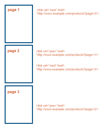
The code on Page 1 will look something like this:
<link rel=”next” href=”http://www.example.com/products?page=2/>
With the code on Page 2 something like this:
<link rel=”prev” href=”http://www.example.com/products?page=1/>
<link rel=”next” href=”http://www.example.com/products?page=3/>
Google recognising this is a hugely useful thing for SEO, as it means that they are recognising what will, in a few years, be a standard across the web, and as such pagination becomes less of a problem. However the wording Google use is quite specific – suggest and indication mean that it’s not a sure-fire thing, and Google will override your suggestion if it feels it knows better or you’ve mucked up the tagging.
Good news if your site is on WordPress; the guys at Yoast have already updated their excellent WordPress SEO plugin to include this functionality, and hopefully it won’t be too long until it is WordPress as standard.
canonical tag
The canonical link tag is regularly suggested as a solution to pagination but it is not recommended and can lead to SEO issues. The canonical tag rel=”canonical” is included within the <head> of a page and basically tells search engines whether there is another version of the page that may contain a lot of the same content and you would prefer them to index in preference to this version. This is commonly used to deal with duplicate content, and suggests to Google that it combines link strength (and other indexing considerations) from the canonicalised versions to the indicated ‘primary’ web address. Again pay attention to the words suggests and prefer – there’s no guarantee they’ll agree with your instructions.
In the issue of pagination the canonical tag is sometimes applied to the non-initial pages (Page 2, Page 3…) to indicate to Google that actually you only want them to index the first page of search results. However this is far from optimal: it means that actual further pages of products aren’t being indexed (fewer indexed pages), we’re potentially losing a lot of useful internal links to products on later pages, and when search engines see that you have different paginated content they’re likely to ignore your instructions in the future! As such it’s definitely not the best option.
The code looks something like this, with the URL you’re suggesting to the ‘primary’:
<link rel=”canonical” href=”http://www.example.com/products” />
‘deoptimised’ pagination
A method for pagination SEO we were inclined to recommend before this announcement was ‘deoptimising’ pagination meta data. This means that Page 1’s meta title and meta description would be well optimised for the products featured, e.g.:
[Product 1] & [Product 2} online | [Products] | Brand
Later pages, like Page 2, would be less keyword optimised and contain pagination information, e.g.:
Page 2 of 5 for [Product 1] & [Product 2] | Brand
This means that all the pages are available for indexing by the search engines, however the first page is likely to be the preferred option to be served within Google search results. You can find a good post summarising pagination and this method on SEOmoz. Certainly before the rel=”prev/next” acceptance this was a preferred pagination approach it’s still a good approach to use in conjunction with the newly recognised tags.
show all
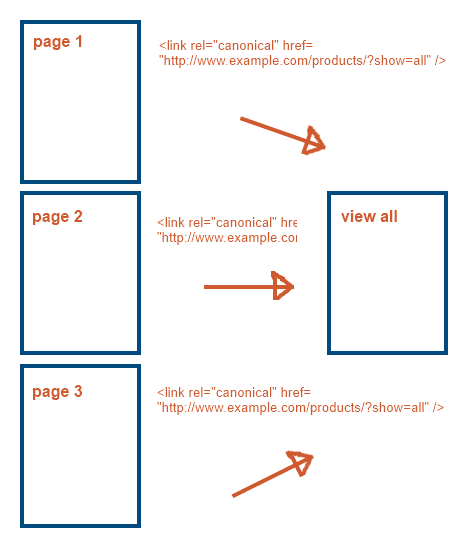
The final, and one of the best, options for pagination is the ‘show all‘ or ‘view all‘ products page. Google has also provided some new advice on using this. The view all page can be used in combination with the canonical tag to effectively remove pagination issues for Google, as you use the canonical to point each paginated web address back to the view all page. Effectively this is suggesting to Google that it should combine all of the indexing attributes of the paginated addresses to one main view all page (instead of Page 1 as with rel=”prev/next”), and just index this one view all page.
It’s a good solution but it has to be done after considering the user experience – do you have 1,000s of products? Will the view all page take ages to load? If so don’t do it, as Google simply won’t agree with your suggestion and may ignore it or push your view all page down the search results. Eep.
The code will look something like this:
<link rel=”canonical” href=”http://www.example.com/products/?show=all” />
summary
In general I’d suggest:
- Lots of products? Use rel=”prev/next” and also consider deoptimising your later pages.
- Not many products? Use rel=”canonical” to point paginated web addresses to your view all page.
However there’ll no doubt be more ongoing debate around this issue – I’d love to hear your comments on what route you’ll be taking.
I’ve been told I’m an angry person. I don’t agree, however I will admit it’s probably true when it comes to computers and anything online. And what gets me most annoyed is when things should be really good and useful and lovely but then aren’t, and turn out to be really annoying and irritating and crappy. Enter Google’s Adwords Campaign Experiments…
UPDATE: Since this was posted Google have updated Adwords Editor to include support for Adwords Campaigns Experiments. You can now change keyword and ad group bid modifiers, but cannot create an experiment and cannot see performance stats. A fair start but not enough!
Adwords Campaign Experiments

Known shorthand as ACE, Adwords Campaign Experiments is a function within Adwords PPC campaigns that enables you to split test changes in your account.
For the uninitiated, split testing involves running two versions of content at the same time, with a proportion of your overall traffic (say 50%) being shown one version and the remainder being shown another version. The results of each version can then be compared against each other, and a winner found. This method largely eliminates external factors that could affect the result, unlike if you had run one version followed by another, as you are randomly showing one variation or the other to people during the same timeframe.
However, to me ACE is anything but ‘ace’. It is akin to having chocolate cake dangled in front of your face, but whenever you try to take a bite you are slapped in the face with a haddock. What should be full of goodness turns out to be extremely fishy.
Problem 1: It’s fiddly
Campaign experiments can be run on a range of elements within your campaign, including keywords, negative keywords and adverts. But my God, it’s like the Crypton Factor just trying to set up your first experiment and even now, after it’s been around for what seems like a year or two, I still find it an absolute mess.
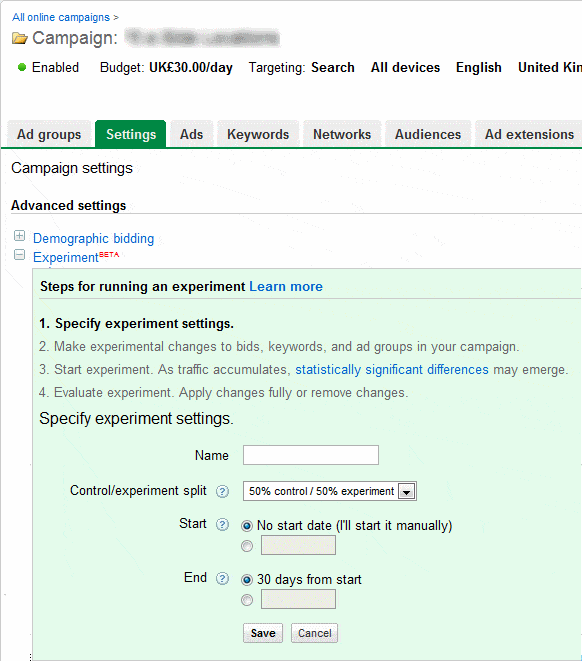
- Navigate to the settings of a particular campaign.
- Open up the Experiment section
- Specify your test
Name
Control/experiment split: This is the proportion of the advert impressions you wish to see the control version and the new experimental settings.
Start date
End date: Standard end date is 30 days from the start of the experiment. - Save your settings
Now it’s time for more fiddling as you try to actually set up your experiment…
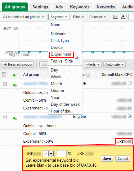
- Go to the menu of the item you wish to test e.g. the ad groups tab for a test on ad group bids.
- Bring down the segment drop-down menu and select experiment.
- You’ll then see additional rows of data beneath each ad group (outside experiment, control, and experiment). Click the particular element you wish to change within the experiment row only e.g. default max CPC for a particular ad group.
- On doing this you’ll see a yellow box appear in which you can set the percentage increase/decrease in the value for your experiment version.
Now you may have noticed (especially if you’ve used ACE much) that this is not a particularly simple, clear or intuitive process. In fact it’s a total pain. What makes it even worse is that it’s SO easy forget that you’re running an experiment on a particular element, because it’s only really obvious when you’ve segmented the data. Therefore it extremely easy to change some settings in the course of general optimisation and ruin weeks of an experiment in one fell swoop. Argh!
Problem 2: Ahhhhh numbers hurt my brain!
One of the big problems with this method of experiments is the sheer number of data rows displayed. For each element we now have four rows of performance data, with the important experimental data not really highlighted. As such it becomes an absolute nightmare to actually extract much useful information visually as you’re faced with number overload.
This issue was compounded when the product was first released as the system didn’t even allow you download/export the data! This has thankfully now been addressed, but again the straight download still requires a fair amount of fiddling to get real insight from. This isn’t a real problem for experienced online marketers, however it’s going to scare off a fair few others.
Problem 3: How MUCH of a change?
Split testing is all about statistical significance. A experimental version has to prove itself, through a mathematical formulae I won’t go into here, to have a high confidence rate of providing a difference (normally at least 95% confidence but we like to see 99%). Google indicates this through the use of little up or down arrows next to each bit of data:
- One arrow = 95% confidence
- Two arrows = 99% confidence
- Three arrows = 99.9% confidence
This is very good, however it doesn’t actually tell you the effect of the test. It tells you whether it’s positive or negative but not to what degree. This means that you then have to extract the data and do the calculations anyway to get the actual improvement. Google have this data, why not show it in an easily-interpretable fashion like website split tests using Google’s Website Optimiser?
Problem 4: Performance weirdness
The final and most damning issue with ACE is the peculiar and nonsensical results you will often see:
Example change:
Increasing an ad group max CPC bid by 30% with 50:50 impression split
Example effect:
Almost all impressions/clicks being sent through the control version, with average position lowering in the experiment from around position 4 to 18.
This is not a specific example I’ve seen, however this is exactly the type of thing I’ve experienced. Why the hell isn’t it following the control:experiment impression split? How has the average position decreased with increased bids? And how the hell did it average at position 18?! There aren’t even 18 ads against the keyword!
Because of this I have lost almost all trust in ACE. The time and hassle it takes to set up a half decent split test, only to see seemingly random stats and performance, really does make it hard to justify a lot of the time. Don’t get me wrong, it’s something I’d love to use a lot more but without trust in the results it’s just not worthwhile.
Problem 5: Try to apply
If you have the patience to get some useful insights and results from ACE, you’ll then want to apply what you’ve learnt from your tests. But be wary. Simply clicking the ‘Apply changes’ button in the campaign settings can cause all sorts of havoc. Did all of your changes have a positive effect? No? Well you’ll only want to apply some then won’t you? Too bad, you’ll have to do that manually. Not set all of your activity not directly included within the experiment to ‘experiment + control’? Too bad, ‘Apply changes’ will only set your ‘experiment’ items live and pause everything else.
Sigh.
Why I hate Adwords Campaign Experiments
Testing is fantastic, and absolutely what you should be doing in your paid search campaigns. However ACE makes a hash of what should be a fantastically valuable offering. What’s all the more confusing is that in Google Website Optimiser they have really good split testing software, however they decide not to use any of the nice display methods used in it. Plus Google have done next to nothing to improve the experience in the time it’s been available.
Some people will no doubt have managed to squeeze some decent results from ACE (former Attacat Johan has asserted that it’s good for affiliate campaigns) but it’s in need of some serious work to get it working properly and turn it into an essential tool.
And this is why I hate Adwords Campaign Experiments.
It’s time for another SEO infographic and ‘link of appreciation’. This one comes from Cognitive SEO and it nicely explains some of the secrets behind Google’s ‘Panda’ update.
I’ve been with Attacat for only four weeks and the update was among many topics being often mentioned in Attacats’ conversations.
While being a newbie and not having much previous experience with SEO, I was especially happy to find this infographic describing key attributes of the update and what’s most important, without the ‘techie’ jargon.
For me, one of the most interesting features is the increased influence of social media. Twitter updates, Facebook likes and Google +1’s are having more and more of an impact on our searches which is bringing new opportunities.
On the other hand, we need to remember to take the following infographic with a pinch of salt. I’d love to hear your opinions. Please comment below if your website has been affected by the update in any way. Below is the condensed version, see the full one here.

Please find a brief overview of all the major events and findings that caught my eye in May. If you think I may have missed something please feel free to share your wisdom in the comments below.
News & Events
April Issues
No doubt the biggest news in the #measure world was the successful fixing of April’s issues in Google Analytics. Thanks to the guys at Google we can now go back and analyse advanced segments and custom reports from April.
Continuing with Google, if you are involved in the Android apps business you will be happy to find out that they have added E-commerce tracking in GA for apps (android logically). Another step towards an entirely measurable life!
Web Analytics TV
Also in Analytics news, May provided us with another very enjoyable episode of Nick & Nash TV show . I would recommend this to anybody involved in Analytics (but only those who don’t use Hit as a metric, Pageview as the KPI and don’t produce unsegmented reports). Usually just one episode gives you more answers than a week of searching (I find Google help a mess).
Happy Birthday Avinash
And to finalise my review of May’s important events, happy 5th birthday to the best web analytics blog in this universe. In my opinion, there is no other resource on the planet as informative and entertaining as Avinash’s blog. Take a minute to check out Avinash’s first blog post , I think its even more relevant now than it was 5 years ago!
Resources
The following section combines all of the tasty links I found this month.
GA Custom Variables
First of all I would like to share a link to the post on GA Custom variables by Justin Cutroni. Custom variables are perhaps the most nerdy part of working with GA, but Justin has a fascinating ability to write about pretty complicated topics without loosing the human language and going in too deep (check out his books too). I would recommend this to anybody who struggles to understand how CVs work!
Site Speed Report
I’m sure you all heard about the new GA interface and the abundance of new reports available. Some of them are still in beta test mode, while some are only available in the States (no shock there), but the Site Speed report is the one that I’m really excited about. This new report provides a fantastic opportunity to improve your site speed, and failing to set it up will cost you dearly! Check out the Lunametrics’ post for details on how to set it up
Feedback tools
In the past I’ve had problems finding the perfect feedback sharing solution . Had the guys from UX Booth wrote this guide earlier, I would have saved a lot of time! Checkout the list of feedback tools with basic description
A look at the past
This interesting find by Brian Eisenberg will definitely make you rethink your marketing strategy. Have a look at how David Oglivy’s speech can and should still be used in your business decision making process
Everything Else
Apple, with all its latest innovations, has managed to outperform Google as the number 1 brand in the world. See details and rest of the brands ranking here
And to finish..
If you have some insightful web analytics resources or an event that I accidently skipped, please feel free to post it in comments and I will add it to the post afterwards (proper attribution and link is guaranteed!)
I feel a little like the F1 presenters now asking you to hit the red button for the post race forum! Not quite as glamorous but I’ll give it a shot…
———————————————
For those of you that attended the recent New Media Breakfast with Kiril Bunin the other morning you will have been able to enjoy Kiril give his opinions on some websites. As with all of these things there can always be a difference of opinion & as such I’ve laid out this blog post to capture some of these points & encourage an ongoing discussion.
I’ve enclosed Craig McGill’s comments that were on the original post – Presentation: Converting you to CRO – along with Kiril’s response to these individual points.
I’d encourage Craig & anyone else who would like to get involved to comment on this article below.
Craig’s Comments
“There’s some cracking points in there – and Kiril was a good presenter – but there were one or two wee things that I disagreed with:
The obvious one is that yes, some of these sites had ‘errors’ but it may be that they just didn’t have the budget or time to do everything that’s been highlighted. I’d love it – and I’m sure many others would too – if they could devote more cash to website development, but in a recession (and a country where many are still sceptical of web/2.0) it’s not always possible.
The first thing that stuck out for me was the comment about Macintyre’s. Kiril felt that it was a mistake not having small question marks next to many of the points – what kind of diamond, what kind of setting – and so on. I see his point (and agree to an extent) but it’s not as much of a deal breaker IMO as he made it out to be. Very few people casually turn up at an engagement ring site and buy. Normally, the lady has picked what she wants – or has strongly influenced the chap and he knows what she wants – it’s not a spontaneous purchase (normally) and people who are normally at the stage of buying an engagement ring have done their homework beforehand (in the case of girls, some have been doing it for years) so the ‘what is this setting?’ type information is (mostly) redundant as the core buying audience already come in armed with the information.
On NKD, I felt he showed a bit of a bias towards SEO instead of plan and simple attention-grabbing. Yes, as he points out, it is a tad brochure and magazine like, but there’s no offence in that as again, this is being aimed at a certain buyer – the person who buys clothes for a company. They want to see something eye-catching and the front-page does that. The first lines of the text explain what they do. It may not be 100% SEO great but I would sacrifice that for readable, eye-catching copy any day of the week.
(On that note though, the page has terrible punctuation and the meta-tagging is awful)
For that one, I thought Kiril was coming at it more from his viewpoint that thinking ‘who is this aimed at and does it work for them?’ but that’s perfectly valid.
On Gulp, I thought he was a tad harsh. Again, it’s individual preferences but I like the WordPress magazine-themed styled front page. I got what the site was about right away and had no issues with it.
With regards to the pages with items on them and no price, I can imagine the reasoning being a fear that if the prices were all on that one page, people may take fright at the costs and leave while if they are on individual pages, people may click backwards and forwards. (Note, I wouldn’t but I’ve seen people hide prices for this reason – and to increase time spent on sites.)
Anyway, just my tuppence. As I said upfront, would be a boring world if we all agreed all of the time!”
Kiril’s Response
“First of all would like to thank you for the time you put into it. I really appreciate you came up with a detailed response because, from my point of view, details are exactly what differentiates feedback from an opinion.
In order to keep the reply clear and understandable I will structure my response in the same order as you:
Regarding the MacIntyre’s Jewellery issues:
I have been asked a lot lately what is the most common conversion roadblock and you just helped me to formulate the optimal response – excuses. It can be limited budgets, ability to test or the recession, but website visitors are interested in their own wants and needs and I have not seen any case when a purchase would be made out of feeling pity for poor business owners’ needs rather their own.
Additionally, let’s not forget that we are talking about a website with a large average order value (AOV). How much would a normal developer charge for solving this issue: £100–£200? That’s half of the average ring price. An organisation should be able to invest half of an AOV into solving a serious issue affecting around 11.75% [based on Google Chrome Users on WikiMedia] of all website traffic.
Regarding scepticism of e-commerce/Web2.0, the UK e-commerce technology market is thought to be worth more than £600m at the end of 2010 so forward-thinking companies should seek to embrace it. The research from Econsultancy found that the sector will grow by 12% this year as companies seek to meet growing demand for online shopping and increased expectations around user experience.
Touching on your point that the website does not require any knowledge base/supportive information, I agree that jewellery is no doubt a high-involvement product requiring in-depth research and in the region of at least 3 visits before purchase but where do you think they are going to do the research? And why would they not buy from the same resource that provided them the information for research? We can ignore the case of a product exclusive to the store as this is obviously a slightly different circumstance.
You are proposing that “We’ll close the sale but we don’t care about educating you, others can do that”. From my experience users convert at sites that can fulfil their needs, including research. The best example would be Blue Nile – the European leader in online jewellery sales.
Regarding NKD:
The only focus of my presentation was CRO and user experience; SEO was not my concern and I don’t believe was mentioned at all.
My comment about the first line was exactly about it not “grabbing attention”. You mentioned yourself “This website is for the person who buys clothes for a company” and this busy person would be in the same boat as any user – how would they notice 4 tiny words inside large paragraphs of text being the only place it mentions “Corporate clothing & staff uniforms” on the entire homepage?
Regarding The Gulp:
I’m afraid I don’t know about “magazine-themed styled front pages” as, again, my focus was not at all on design but user experience, and my live 5-second test truly proved that the user experience is broken. Hardly even 10% of audience got the actual specification of the site and none of them even thought about where to start. I’m glad you did, but CRO is about optimising for the masses and basing serious decisions on a single opinions would be a mistake.
Finally about not showing prices on category pages:
This is another common point I don’t understand – why do you think somebody who will get frightened of prices on the category page would suddenly lose that fear on a product page? It can be seen as dishonest, and according to a recent report “Pricing/shipping information is clearly stated as the issue bothering 95% of e-shoppers” (http://www.getelastic.com/customer-expectations/). Visitors are humans and if a website wants to increase conversion rate then satisfying their needs should be the primary goal, not ‘tricking’ them into staying on site.
Thanks again for your feedback. Believe me I very often disagree with majority of opinions as well (ask attacats) and completely agree that the world is much more interesting place when we can freely say what we think. Healthy discussion never harms anybody!”
—————————–
Let the debating commence!
As promised, here are the slides and some useful links from my presentation.
And some links to tools mentioned in presentation
Data Visualisation
Juice Analytics – Keyword data visualisation
Paditrack – Fascinating opportunities for Funnel Visualisation
Data Gathering
UserTesting – Online User Testing Solution
Clicktale – Most complete set of Clickstream data capturing methods
CrazyEgg – More Accessible & simplified Clickstream Data
4Q – Entry/Exit Survey
KISSinsights – On Page Survey
SurveyMonkey – Easy to setup online survey tool
Testing
Google Website Optimiser – Free testing tool by Google
Visual Website Optimiser – Less hassle testing
Optimizely – Another no developer testing software
If I forgot to mention something or you have any questions please leave a comment and we will solve it in not time.
Finally, would like to thank you all again for being patient enough to stand out entire hour listening to me
 With plenty predicting that 2011 will be a year of Conversion Rate Optimisation we definitely think we’re looking forward to providing you with valuable insights towards increasing the conversion rate of your online channels this year. Our first topic doesn’t get much ‘buzz’ – it’s average order value (AOV), and basic tactics and methods for increasing this metric.
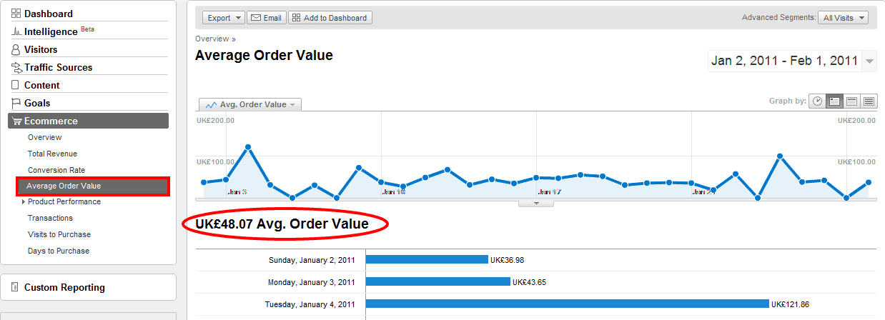
Firstly let’s get the definition right – the AOV indicator is usually used with e-commerce sites describing (surprise surprise) the average order value metric; literally the average amount of money your user spends during one transaction. In Google Analytics you can easily find it under the e-commerce tab:
Even though I’m going to use e-commerce sites as an example, AOV of some kind can be used in other types of sites as well: lead generation sites (AOV is the average value of services user is quoted for), subscription websites (average type of plan and duration), even content monetising resources can use a combination of average length and depth of visits.
If you have a problem with measuring the value of your average conversion then leave a comment below and we’ll be happy to help you out.
Some of you might ask “What’s this got to do with CRO?” and would be relatively justified. Not a lot of publications are mentioning AOV in the CRO process, but if we have a look at a some definitions of CRO and AOV this question will disappear…
CRO: Increasing number of sales/leads/subscriptions/any measurable business goals without increasing the amount of visitors; in simple terms persuading an existing visitor base to convert more often.
Tweak this slighty:
AOV: Increasing the value of sales/leads/subscriptions/any measurable business goals without increasing the amount of visitors; in simple terms persuading an existing visitor base to convert with a higher value.
The most important thing that CRO and AOV optimisation share is a focus on improving user experience and the expected value, rather than trying to mislead the user with dodgy/cheap sales tricks.
Cross-selling and up-selling
Cross-selling and up-selling are the two primary methods responsible for improving your AOV and every tip I’ll be sharing below is somehow related to one of them. Originally I was planning to precisely define each tip, but with several quite controversial definitions and opinions available in online publications or blogs I’m not going to waste the time. In the end the purpose of this post is to provide actionable insights rather than formulate the optimal definition.
1. Word choice
Some might think that this is a low importance factor but bear in mind how the human brain digests information – users would rather scan your landing page than read it through line-by-line, and the headline might be the only thing they notice. The quality of a headline should engage the user to notice your up-selling offer rather than lose their attention.
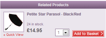
The most commonly used headings are without doubt “related products” or “similar products”. These are both useless in terms of justifying benefits for the user and so commonly used that are overseen by majority of users (similar to banner blindness).
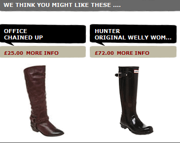
Lots of retailers self-confidently propose they know what I might like. Are they using mind-reading technology? CIA contacts? Seriously, how do they know? Each year I struggle with Christmas presents and could really use this solution…
None of these examples are giving a user some reason to spend more. Why should I buy more? Why do I need this additional item? These are just basic questions we all are going to ask ourselves and answering them should be the main priority of any e-commerce shop looking for the AOV increase.
Another issue I’ve started to hear more and more during user tests is a genuine hatred towards any kind of up-selling technique. With all the “recommendations” we are hearing from sales people in almost every brick and mortar store, restaurant or even internet provider we have completely lost any trust towards advice made by the interested party. Not least because the majority of these suggestions will be based on a company’s sales strategies rather than our needs, likes or benefits.
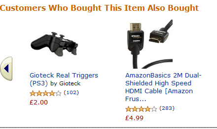
I hate using Amazon and other giants as an example (in majority of cases elements working at amazon would not work on your site) but with the word choice they are on top (although I’m sure there are plenty of other sites using similar headlines):
This type of headline above will kill two birds with one stone: provide sufficient enough reason for users to investigate the offers (word choice promotes indirect social prove – “If others bought something else with the same item than I should check it as well”) and eliminate a user’s negative opinion towards up-selling techniques (the heading clearly states that the choice of product for the up-sell is based on real user behaviour rather than sales objectives.)
2. Placement
While the importance of the last point is quite arguable and can vary from site to site, the placement of the up-sell/cross-sell promotion box will without doubt make a huge difference in the vast majority of e-shops. Unfortunately any common guidance or advice with placement would be literally useless because the effectiveness of any promo box will strongly correlate with your general page layout, primary product placement, hero image, calls-to-action (CTA) and so on.
However, there might be one suitable for everybody:
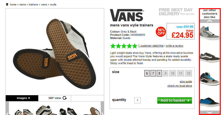
Avoid side skyscraper style placements or any format looking like a banner ad
The reason is simple – users rarely look at anything that looks like ad whether or not it is actually an ad. Banner blindness was real already 10 years ago and I am more than sure it is dramatically evolving year after year.
3. Focus on eye flow
There is a very common myth in the internet marketing industry that if you want to attract attention to a particular element or CTA just highlight it with bright screaming colours and enlarge to enormous size. If that were true then the annoying animated .gif banners from the 90s would still be the most effective method for customer acquisition.
Even if you’ve observed this type of change increasing click-through rate once or twice it doesn’t mean it works all the time. If your user is not even paying attention to the element or is dedicated towards a different one, no matter what colour or size you choose you are not going to engage him. Additionally, always bear in mind that in increasing the prominence of your up- or cross-selling offers you will always damage the prominence of your primary product. In the end, even if you succeed with the cross-sell promotion it doesn’t add additional value if the user doesn’t buy the original product.
Rather than wasting your time on highlighting your offer, focus on the eye flow of your average user and try to include the promo box where it naturally fits in with this and the decision making process.
Disclaimer: For those who haven’t heard about eye flow or require a quick reminder please check Anne Holland’s definition. Precise eye flow on your website can be investigated with eye tracking research, however due to very extreme costs we usually will use either Feng-gui (software simulating human vision mechanisms) or a couple of sessions of user tests with focus on eye flow.
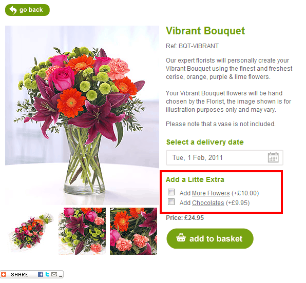
The example above clearly displays the points I was trying to raise. Neither bright colours nor extreme size make this cross-sell successful. It is a naturally-placed element fitting the eye flow (as the majority of users would start their fixation with hero image, briefly scan the copy, fixate on delivery field and then naturally scan additional items while moving towards the CTA) and the decision-making process (user has chosen specific product, then delivery date and now can think if he/she requires additional items).
4. One step further
The last method of increasing AOV I’ll share in this post is closely related to the decision-making process I’ve just mentioned.
With high-involvement products or services it might be a good idea to secure conversion on the primary product before introducing the up-/cross-sell on a separate page later in the funnel.
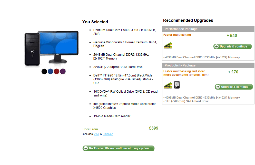
I guess Dell was the first serious e-commerce provider to implement this tactic in combination with standard up-sell methods.
Here a user lands on a product page after choosing a specific product. Note how many specifications the primary product already has, and imagine how much time and patience it takes for a user to choose the right one for them without any ‘recommendations’. It required a lot of user involvement and thought.
By allowing your user to take fewer decisions per page you can spectacularly simplify the entire process for them and decrease the anxiety which is usually impossible to avoid with these high involvement purchases.
And to finish…
Hopefully the set of tips above will help you to have another look towards you up-/cross-selling tactics and motivate you to start testing different variations. We have plenty of other tips and tactics for both AOV and traditional CRO coming soon, so subscribe to our RSS or start following us on Twitter @Attacats to stay in touch.
I’d be more than happy to hear some tips on increasing AOV from all of you so please share your ideas or question in the comments. Happy testing!
