Looks like a change to the Google SERPs (Search Engine Results Page) for some folks today – PPC listings have a bit more real estate at the top of the page. Certainly looks a bit funny but pushes down the top organics & makes those few top spots even more important than before!
The change has now moved the display URL under the actual adverts themselves hence stretching the size of the advertising space. The screen shots below also show how a map listing extension would be shown in these new SERPs (actually making the space even bigger).
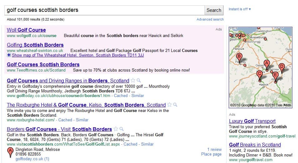
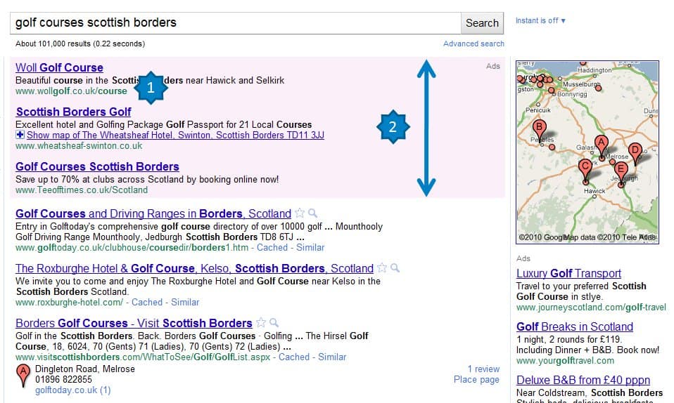
The old & new SERPs are shown below but based on some scientific measurements (well not quite but reasonably accurate) the top ‘ads’ section has been increased by about 30% by this change.
Click screen grabs for larger images…
Yesterday’s SERP
Today’s SERP
The Changes:
- The display URL is now shown under the advert copy (rather than before it). This extends the size of the ads box
- As the display URL is now under the advert there is much more ‘white space’ over in the right hand side of the ads box – drawing the eye in
- This overall has seen an increase in the ads space of about 30%


